The project
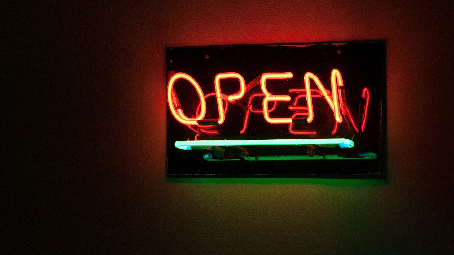
A blade sign has to read correctly from both directions of foot traffic, which meant bending and filling two full mirror-image letter sets rather than one — a detail that doubles the glass-bending time on a project like this compared to a single flat storefront sign of the same size. Sapphire blue was chosen over plain argon blue specifically because the phosphor coating holds a more even, saturated color across the full run than the paler bare argon/mercury discharge would at this length.
Each face runs on its own transformer so either side can be serviced independently without dark-shopping the whole sign.